With the advent of statistical techniques to infer protein contacts from multiple sequence alignments (which you can read more about here), accurate protein structure prediction in the absence of a template has become possible. Taking advantage of this fact, there have been efforts to brave the sea of protein families for which no structure is known (about 8,500 – over 50% of known protein families) in an attempt to predict their topology. This is particularly exciting given that protein structure prediction has been an open problem in biology for over 50 years and, for the first time, the community is able to perform large-scale predictions and have confidence that at least some of those predictions are correct.
Based on these trends, last group meeting I presented a paper entitled “Large-scale structure prediction by improved contact predictions and model quality assessment”. This paper is the culmination of years of work, making use of a large number of computational tools developed by the Elofsson Lab at Stockholm University. With this blog post, I hope to offer some insights as to the innovative findings reported in their paper.
Let me begin by describing their structure prediction pipeline, PconsFold2. Their method for large-scale structure prediction can be broken down into three components: contact prediction, model generation and model quality assessment. As the very name of their article suggests, most of the innovation of the paper stems from improvements in contact prediction and the quality assessment protocols used, whereas for their model generation routine, they opted to sacrifice some quality in favour of speed. I will try and dissect each of these components over the next paragraphs.
Contact prediction relates to the process in which residues that share spatial proximity in a protein’s structure are inferred from multiple sequence alignments by co-evolution. I will not go into the details of how these protocols work, as they have been previously discussed in more detail here and here. The contact predictor used in PconsFold2 is PconsC3, which is another product of the Elofsson Lab. There was some weirdness with the referencing of PconsC3 on the PconsFold2 article, but after a quick google search, I was able to retrieve the article describing PconsC3 and it was worth a read. Other than showcasing PconsC3’s state-of-the-art contact prediction capabilities, the original PconsC3 paper also provides figures for the number of protein families for which accurate contact prediction is possible (over 5,000 of the ~8,500 protein families in Pfam without a member of known structure). I found the PconsC3 article feels like a prequel to the paper I presented. The bottom line here is that PconsC3 is a reliable tool for predicting contacts from multiple sequence alignments and is a sensible choice for the PconsFold2 pipeline.
Another aspect of contact prediction that the authors explore is the idea that the precision of contact prediction is dependent on the quality of the underlying multiple sequence alignment (MSA). They provide a comparison of the Positive Predicted Value (PPV) of PconsC3 using different MSAs on a test set of 626 protein domains from Pfam. To my knowledge, this is the first time I have encountered such a comparison and it serves to highlight the importance the MSA has on the quality of resulting contact predictions. In the PconsFold2 pipeline, the authors use consensus approach; they identify the consensus of four predicted contact maps each using a different alignment. Alignments were generated using Jackhmmer and HHBlits at E-Value cutoffs of 1 and 10^-4.
Now, moving on to the model generation routine. PconsFold2 makes use of CONFOLD to perform model generation. CONFOLD, in turn, uses the simulated annealing routine of the Crystallographic and NMR System (CNS) to produce models based on spatial and geometric constraints. To derive those constraints, predicted secondary structure and the top 2.5 L predicted contacts are given as input. The authors do note that the refinement stage of CONFOLD is omitted, which is a convenience I assume was adopted to save computational time. The article also acknowledges that models generated by CONFOLD are likely to be less accurate than the ones produced by Rosetta, yet a compromise was made in order to make the large-scale comparison feasible in terms of resources.
One particular issue that we often discuss when performing structure prediction is the number of models that should be produced for a particular target. The authors performed a test to assess how many decoys should be produced and, albeit simplistic in their formulation, their results suggest that 50 models per target should be sufficient. Increasing this number further did not lead to improvements in the average quality of the best models produced for their test set of 626 proteins.
After producing 50 models using CONFOLD, the final step in the PconsFold2 protocol is to select the best possible model from this ensemble. Here, they present a novel method, PcombC, for ranking models. PcombC combines the clustering-based method Pcons, the single-model deep learning method ProQ3D, and the proportion of predicted contacts that are present in the model. These three scores are combined linearly, and are given weights that were optimised via a parameter sweep. One of my reservations relating to this paper is that little detail is given regarding the data set that was used to perform this training. It is unclear from their methods section if the parameter sweep was trained on the test set with 626 proteins used throughout the manuscript. Given that no other data set (with known structures) is ever introduced, this scenario seems likely. Therefore, all the classification results obtained by PcombC, and all of the reported TM-score Top results should be interpreted with care since performance on validation set tends to be poorer than on a training set.
Recapitulating the PconsFold2 pipeline:
- Step 1: generate four multiple sequence alignments using HHBlits and Jackhmmer.
- Step 2: generate four predicted contact maps using PconsC3.
- Step 3: Use CONFOLD to produce 50 models using a consensus of the contact maps from step 2.
- Step 4: Use PCombC to rank the models based on a linear combination of the Pcons and ProQ3D scores and the proportion of predicted contacts that are present in the model.
So, how well does PconsFold2 perform? The conclusion is that it depends on the quality of the contact predictions. For the protein families where abundant sequence information is available, PconsFold2 produces a correct model (TM-Score > 0.5) for 51% of the cases. This is great news. First, because we know which cases have abundant sequence information beforehand. Second, because this comprises a large number of protein families of unknown structure. As the number of effective sequence (a common way to assess the amount of information available on an MSA) decreases, the proportion of families for which a correct model has been generated also decreases, which restricts the applicability of their method to protein families with abundant sequence information. Nonetheless, given that protein sequence databases are growing exponentially, it is possible that over the next years, the number of cases where protein structure prediction achieves success is likely to increase.
One interesting detail that I was curious about was the length distribution of the cases where modelling was successful. Can we detect the cases for which good models were produced simply by looking at a combination of length and number of effective sequences? The authors never address this question, and I think it would provide some nice insights as to which protein features are correlated to modelling success.
We are still left with one final problem to solve: how do we separate the cases for which we have a correct model from the ones where modelling has failed? This is what the authors address with the last two subsections of their Results. In the first of these sections, the authors compare four ways of ranking decoys: PcombC, Pcons, ProQ3D, and the CNS contact score. They report that, for the test set of 626 proteins, PcombC obtains the highest Pearson’s Correlation Coefficient (PCC) between the predicted and observed TM-Score of the highest ranking models. As mentioned before, this measure could be overestimated if PcombC was, indeed, trained on this test set. Reported PCCs are as follows: PcombC = 0.79, Pcons = 0.73, ProQ3D = 0.67, and CNS-contact = -0.56.
In their final analysis, the authors compare the ability of each of the different Quality Assessment (QA) scores to discern between correct and incorrect models. To do this, they only consider the top-ranked model for each target according to different QA scores. They vary the false positive rate and note the number of true positives they are able to recall. At a 10% false positive rate, PcombC is able to recall about 50% of the correct models produced for the test set. This is another piece of good news. Bottomline is: if we have sufficient sequence information available, PconsFold2 can generate a correct model 51% of the time. Furthermore, it can detect 50% of these cases, meaning that for ~25% of the cases it produced something good and it knows the model is good. This opens the door for looking at these protein families with no known structure and trying to accurately predict their topology.
That is exactly what the authors did! On the most interesting section of the paper (in my opinion), the authors predict the topology of 114 protein families (at FPR of 1%) and 558 protein families (at FPR of 10%). Furthermore, the authors compare the overlap of their results with the ones reported by a similar study from the Baker group (previously presented at group meeting here) and find that, at least for some cases, the predictions agree. These large-scale efforts force us to revisit the way we see template-free structure prediction, which can no longer be dismissed as a viable way of obtaining structural models when sufficient sequences are available. This is a remarkable achievement for the protein structure prediction community, with the potential to change the way we conduct structural biology research.


 , and we perform arithmetic based on this ten digit notation. This doesn’t always matter much for pen and paper maths but it’s an integral part of how we think about more complex operations and in particular how we think about accuracy. We see
  as a finite decimal fraction, and so it’s only natural that we should be able to do accurate sums with it. And if we can do simple arithmetic, then surely computers can too? In this blog post I’m going to try and briefly explain what causes rounding errors such as the one above, and how we might get away with going beyond machine precision.
 , say
, say  . The decimal representation of
  is of the form
 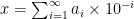 . The
. The 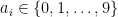 here are the digits that go after the radix point. In the case of
  , or
, or  . Some numbers, such as our favourite
  , do, meaning that after some
  , all
, all  . When we talk about rounding errors and accuracy, what we actually mean is that we only care about the first few digits, say
  , and we’re happy to approximate to
 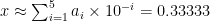 , potentially rounding up at the last digit.
 ,
,  to represent the same number. Our favourite number
  rather than
  , despite the fact it appears as the latter on a computer screen. Crucially, arithmetic is done in base-2 and, since only a finite number of binary digits are stored (
 for most purposes these days), rounding errors also occur in base-2.
 also have a finite decimal expansion, meaning we can do accurate arithmetic with them in both systems. However, the reverse isn’t true, which is what causes the issue with
  . In binary, the nice and tidy
  . We observe the rounding error because unlike us, the computer is trying to sum over infinite series.
 , where
  . In the example above, the issue comes from dividing by 10 on each side of the (in)equality. Luckily for us, we can avoid doing so. Integer arithmetic is easy in any base, and so
 and shifting the division by
  to the right-hand side of each inequality / assignment operator:
 ), implementing the above lets us compute
  with arbitrary precision given by


