Monthly Archives: January 2017

R or Python for data vis?

Python users: ever wanted to learn R?
R users: ever wanted to learn Python?
Check out: http://mathesaurus.sourceforge.net/r-numpy.html

Both languages are incredibly powerful for doing large-scale data analyses. They both have amazing data visualisation platforms, allowing you to make custom graphs very easily (e.g. with your own set of fonts, color palette choices, etc.) These are just a quick run-down of the good, bad, and ugly:

R

  • The good:
    • More established in statistical analyses; if you can’t find an R package for something, chances are it won’t be available in Python either.
    • Data frame parsing is fast and efficient, and incredibly easy to use (e.g. indexing specific rows, which is surprisingly hard in Pandas)
    • If GUIs are your thing, there are programs like Rstudio that mesh the console, plotting, and code.
  • The bad:
    • For loops are traditionally slow, meaning that you have to use lots of apply commands (e.g. tapply, sapply).
  • The ugly:
    • Help documentation can be challenging to read and follow, leading to (potentially) a steep learning curve.

Python

  • The good:
    • If you have existing code in Python (e.g. analysing protein sequences/structures), then you can plot straight away without having to save it as a separate CSV file for analysis, etc.
    • Lots of support for different packages such as NumPy, SciPy, Scikit Learn, etc., with good documentation and lots of help on forums (e.g. Stack Overflow)
    • It’s more useful for string manipulation (e.g. parsing out the ordering of IMGT numbering for antibodies, which goes from 111A->111B->112B->112A->112)
  • The bad:
    • Matplotlib, which is the go-to for data visualisation, has a pretty steep learning curve.
  • The ugly:
    • For statistical analyses, model building can have an unusual syntax. For example, building a linear model in R is incredibly easy (lm), whereas Python involves sklearn.linear_model.LinearRegression().fit. Otherwise you have to code up a lot of things yourself, which might not be practical.

For me, Python wins because I find it’s much easier to create an analysis pipeline where you can go from raw data (e.g. PDB structures) to analysing it (e.g. with BioPython) then plotting custom graphics. Another big selling point is that Python packages have great documentation. Of course, there are libraries to do the analyses in R but the level of freedom, I find, is a bit more restricted, and R’s documentation means you’re often stuck interpreting what the package vignette is saying, rather than doing actual coding.

As for plotting (because pretty graphs are where it’s at!), here’s a very simple implementation of plotting the densities of two normal distributions, along with their means and standard deviations.

import numpy as np
from matplotlib import rcParams

# plt.style.use('xkcd') # A cool feature of matplotlib is stylesheets, e.g. make your plots look XKCD-like

# change font to Arial
# you can change this to any TrueType font that you have in your machine
rcParams['font.family'] = 'sans-serif'
rcParams['font.sans-serif'] = ['Arial']

import matplotlib.pyplot as plt
# Generate two sets of numbers from a normal distribution
# one with mean = 4 sd = 0.5, another with mean (loc) = 1 and sd (scale) = 2
randomSet = np.random.normal(loc = 4, scale = 0.5, size = 1000)
anotherRandom = np.random.normal(loc = 1, scale = 2, size = 1000)

# Define a Figure and Axes object using plt.subplots
# Axes object is where we do the actual plotting (i.e. draw the histogram)
# Figure object is used to configure the actual figure (e.g. the dimensions of the figure)
fig, ax = plt.subplots()

# Plot a histogram with custom-defined bins, with a blue colour, transparency of 0.4
# Plot the density rather than the raw count using normed = True
ax.hist(randomSet, bins = np.arange(-3, 6, 0.5), color = '#134a8e', alpha = 0.4, normed = True)
ax.hist(anotherRandom, bins = np.arange(-3, 6, 0.5), color = '#e8291c', alpha = 0.4, normed = True)

# Plot solid lines for the means
plt.axvline(np.mean(randomSet), color = 'blue')
plt.axvline(np.mean(anotherRandom), color = 'red')

# Plot dotted lines for the std devs
plt.axvline(np.mean(randomSet) - np.std(randomSet), linestyle = '--', color = 'blue')
plt.axvline(np.mean(randomSet) + np.std(randomSet), linestyle = '--', color = 'blue')

plt.axvline(np.mean(anotherRandom) - np.std(anotherRandom), linestyle = '--', color = 'red')
plt.axvline(np.mean(anotherRandom) + np.std(anotherRandom), linestyle = '--', color = 'red')

# Set the title, x- and y-axis labels
plt.title('A fancy plot')
ax.set_xlabel("Value of $x$") 
ax.set_ylabel("Density")

# Set the Figure's size as a 5in x 5in figure
fig.set_size_inches((5,5))

Figure made by matplotlib using the code above.

randomSet = rnorm(mean = 4, sd = 0.5, n = 1000)
anotherRandom = rnorm(mean = 1, sd = 2, n = 1000)

# Let's define a range to plot the histogram for binning;
limits = range(randomSet, anotherRandom)
lbound = limits[1] - (diff(limits) * 0.1)
ubound = limits[2] + (diff(limits) * 0.1)
# use freq = F to plot density
# in breaks, we define the bins of the histogram by providing a vector of values using seq
# xlab, ylab define axis labels; main sets the title
# rgb defines the colour in RGB values from 0-1, with the fourth digit setting transparency
# e.g. rgb(0,1,0,1) is R = 0, G = 1, B = 0, with a alpha of 1 (i.e. not transparent)
hist(randomSet, freq = F, breaks = seq(lbound, ubound, 0.5), col = rgb(0,0,1,0.4), xlab = 'Value of x', ylab = 'Density', main = 'A fancy plot')
# Use add = T to keep both histograms in one graph
# other parameters, such as breaks, etc., can be introduced here
hist(anotherRandom, freq = F, breaks = seq(lbound, ubound, 0.5), col = rgb(1,0,0,0.4), add = T)

# Plot vertical lines with v =
# lty = 2 generates a dashed line
abline(v = c(mean(randomSet), mean(anotherRandom)), col = c('blue', 'red'))

abline(v = c(mean(randomSet)-sd(randomSet), mean(randomSet)+sd(randomSet)), col = 'blue', lty = 2)
abline(v = c(mean(anotherRandom)-sd(anotherRandom), mean(anotherRandom)+sd(anotherRandom)), col = 'red', lty = 2)

Similar figure made using R code from above.

*Special thanks go out to Ali and Lyuba for helpful fixes to make the R code more efficient!

Confidence (scores) in STRING

There are many techniques for inferring protein interactions (be it physical binding or functional associations), and each one has its own quirks: applicability, biases, false positives, false negatives, etc. This means that the protein interaction networks we work with don’t map perfectly to the biological processes they attempt to capture, but are instead noisy observations.

The STRING database tries to quantify this uncertainty by assigning scores to proposed protein interactions based on the nature and quality of the supporting evidence. STRING contains functional protein associations derived from in-house predictions and homology transfers, as well as taken from a number of externally maintained databases. Each of these interactions is assigned a score between zero and one, which is (meant to be) the probability that the interaction really exists given the available evidence.

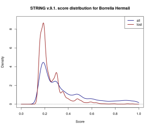
Throughout my short research project with OPIG last year I worked with STRING data for Borrelia Hermsii, a relatively small network of scored interactions across 815 proteins. I was working with v.10.0., the latest available database release, but also had the chance to compare this to v.9.1 data. I expected that with data from new experiments and improved scoring methodologies available, the more recent network would be more or less a re-scored superset of the older. Even if some low-scored interactions weren’t carried across the update, I didn’t expect these to be any significant proportion of the data. Interestingly enough, this was not the case.

Out of 31 264 scored protein-protein interactions in v.9.1. there were 10 478, i.e. almost exactly a third of the whole dataset, which didn’t make it across the update to v.10.0. The lost interactions don’t seem to have very much in common either — they come from a range of data sources and don’t appear to be located within the same region of the network. The update also includes 21 192 previously unrecorded interactions.

densityComparison

Gaussian kernel density estimates for the score distribution of interactions across the entire 9.1. Borrelia Hermsii dataset (navy) and across the discarded proportion of the dataset (dark red). Proportionally more low-scored interactions have been discarded.

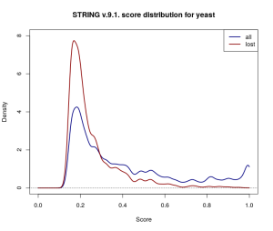
Repeating the comparison with baker’s yeast (Saccharomyces cerevisiae), a much more extensively studied organism, shows this isn’t a one-off case either. The yeast network is much larger (777 589 scored interactions across 6400 proteins in STRING v.9.1.), and the changes introduced by v.10.0. appear to be scaled accordingly — 237 427 yeast interactions were omitted in the update, and 399 836 new ones were added.

discardedYeast

Kernel density estimates for the score distribution for yeast in STRING v.9.1. While the overall (navy) and discarded (dark red) score distributions differ from the ones for Borrelia Hermsii above, a similar trend of omitting more low-scored edges is observed.

So what causes over 30% of the scored interactions in the database to disappear into thin air? At least in part this may have to do with thresholding and small changes to the scoring procedure. STRING truncates reported interactions to those with a score above 0.15. Estimating how many low-scored interactions have been lost from the original dataset in this way is difficult, but the wide coverage of gene co-expression data would suggest that they’re a far from negligible proportion of the scored networks. The changes to the co-expression scoring pipeline in the latest release [1], coupled with the relative abundance of co-expression data, could have easily shifted scores close to 0.15 on the other side of the threshold, and therefore might explain some of the dramatic difference.

However, this still doesn’t account for changes introduced in other channels, or for interactions which have non-overlapping types of supporting evidence recorded in the two database versions. Moreover, thresholding at 0.15 adds a layer of uncertainty to the dataset — there is no way to distinguish between interactions where there is very weak evidence (i.e. score below 0.15), pairs of proteins that can be safely assumed not to interact (i.e. a “true” score of 0), and pairs of proteins for which there is simply no data available. While very weak evidence might not be of much use when studying a small part of the network, it may have consequences on a larger scale: even if only a very small fraction of these interactions are true, they might be indicative of robustness in the network, which can’t be otherwise detected.

In conclusion, STRING is a valuable resource of protein interaction data but one ought to take the reported scores with a grain of salt if one is to take a stochastic approach to protein interaction networks. Perhaps if scoring pipelines were documented in a way that made them reproducible and if the data wasn’t thresholded, we would be able to study the uncertainty in protein interaction networks with a bit more confidence.

References:

[1] Szklarczyk, Damian, et al. “STRING v10: protein–protein interaction networks, integrated over the tree of life.” Nucleic acids research (2014): gku1003

Interesting Antibody Papers

Below are two somewhat recent papers that are quite relevant to those doing ab-engineering. The first one takes a look at antibodies as a collection — software which better estimates a diversity of an antibody repertoire. The second one looks at each residue in more detail — it maps the mutational landscape of an entire antibody, showing a possible modulating switch for VL-CL interface.

Estimating the diversity of an antibody repertoire. (Arnaout Lab) paper here. High Throughput Sequencing (or next generation sequencing…) of antibody repertoires allows us to get snapshots of the overall antibody population. Since the antibody population ‘diversity’ is key to their ability to find a binder to virtually any antigen, it is desirable to quantify how ‘diverse’ the sample is as a way to see how broad you need to cast the net. Firstly however, we need to know what we mean by ‘diversity’. One way of looking at it is akin to considering ‘species diversity’, studied extensively in ecology. For example, you estimate the ‘richness’ of species in a sample of 100 rabbits, 10 wolves and 20 sheep. Diversity measures such as Simpson’s index or entropy were used to calculate how biased the diversity is towards one species. Here the sample is quite biased towards rabbits, however if instead we had 10 rabbits, 10 wolves and 10 sheep, the ‘diversity’ would be quite uniform. Back to antibodies: it is desirable to know if a given species of an antibody is more represented than others or if one is very underrepresented. This might indicate healthy vs unhealthy immune system, indicate antibodies carrying out an immune response (when there is more of a type of antibody which is directing the immune response). Problem: in an arbitrary sample of antibody sequences/reads tell me how diverse they are. We should be able to do this by estimating the number of cell clones that gave rise to the antibodies (referred to as clonality). People have been doing this by grouping sequences by CDR3 similarity. For example, sequences with CDR3 identical or more than >95% identity, are treated as the same cell — which is tantamount to being the same ‘species’. However since the number of diverse B cells in a human organism is huge, HTS only provides a sample of these. Therefore some rarer clones might be underrepresented or missing altogether. To address this issue, Arnaout and Kaplinsky developed a methodology called Recon which estimates the antibody sample diversity. It is based on the expectation-maximization algorithm: given a list of species and their numbers, iterate adding parameters until they have a good agreement between the fitted distributions and the given data. They have validated this methodology firstly on the simulated data and then on the DeKosky dataset. The code is available from here subject to their license agreement.

Thorough analysis of the mutational landscape of the entire antibody. [here]. (Germaine Fuh from Affinta/Genentech/Roche). The authors aimed to see how malleable the variable antibody domains are to mutations by introducing all possible modifications at each site in an example antibody. As the subject molecule they have used high-affinity, very stable anti-VEGF antibody G6.31. They argue that this antibody is a good representative of human antibodies (commonly used genes Vh3, Vk1) and that its optimized CDRs might indicate well any beneficial distal mutations. They confirm that the positions most resistant to mutation are the core ones responsible for maintaining the structure of the molecule. Most notably here, they have identified that Kabat L83 position correlates with VL-CL packing. This position is most frequently a phenylalanine and less frequently valine or alanine. This residue is usually spatially close to isoleucine at position LC-106. They have defined two conformations of L83F — in and out:

  1. Out: -50<X1-100 interface.
  2. In: 50<X1<180

Being in either of these positions correlates with the orientation of LC-106 in the elbow region. This in turn affects how big the VL-CL interface is (large elbow angle=small  tight interface; small elbow angle=large interface). The L83 position often undergoes somatic hypermutation, as does the LC-106 with the most common mutation being valine.

CCP4 Study Weekend 2017: From Data to Structure

This year’s CCP4 study weekend focused on providing an overview of the process and pipelines available, to take crystallographic diffraction data from spot intensities right through to structure. Therefore sessions included; processing diffraction data, phasing through molecular replacement and experimental techniques, automated model building and refinement. As well as updates to CCP4 and where is crystallography going to take us in the future?

Surrounding the meeting there was also a session for Macromolecular (MX) crystallography users of Diamond Light Source (DLS), which gave an update on the beamlines, and scientific software, as well as examples of how fragment screening at DLS has been used. The VMXi (Versatile Macromolecular X-tallography in-situ) beamline is being developed to image crystals that are forming in situ crystallisation plates. This should allow for crystallography to be optimized, as crystallization conditions can be screened, and data collected on experiments as they crystallise, especially helpful in cases where crystallisation has routinely led to non-diffracting crystals. VXMm is a micro/nanofocus MX beamline, which is in development, with a focus to get crystallographic from very small crystals (~300nm to 10 micron diameters, with a bias to the smaller size), thereby allowing crystallography of targets that have previously been hard to get sufficient crystals. Other updates included how technology developed for fast solid state data collection on x-ray free electron lasers (XFEL) can be used on synchrotron beamlines.

A slightly more in-depth discussion of two tools presented that were developed for use alongside and within CCP4, which might be of interest more broadly:

ConKit: A python interface for contact prediction tools

Contact prediction for proteins, at its simplest, involves estimating which residues within a certain certain spatial proximity of each other, given the sequence of the protein, or proteins (for complexes and interfaces). Two major types of contact prediction exist:

  • Evolutionary Coupling
  • Supervised machine learning
    • Using ab initio structure prediction tools, without sequence homologues, to predict which contacts exist, but with a much lower accuracy than evolutionary coupling.

fullscreen

ConKit is a python interface (API) for contact prediction tools, consisting of three major modules:

  • Core: A module for constructing hierarchies, thereby storing necessary data such as sequences in a parsable format.
    • Providing common functionality through functions that for example declare a contact as a false positive.
  • Application: Python wrappers for common contact prediction and sequence alignment applications
  • I/O: I/O interface for file reading, writing and conversions.

Contact prediction can be used in the crystallographic structure determination field, during unconventional molecular replacement, using a tool such as AMPLE. Molecular replacement is a computational strategy to solve the phase problem. In the typical case, by using homologous structures to determine an estimate a model of the protein, which best fits the experimental diffraction intensities, and thus estimate the phase. AMPLE utilises ab initio modeling (using Rosetta) to generate a model for the protein, contact prediction can provide input to this ab initio modeling, thereby making it more feasible to generate an appropriate structure, from which to solve the phase problem. Contact prediction can also be used to analyse known and unknown structures, to identify potential functional sites.

For more information: Talk given at CCP4 study weekend (Felix Simkovic), ConKit documentation

ACEDRG: Generating Crystallographic Restraints for Ligands

Small molecule ligands are present in many crystallographic structures, especially in drug development campaigns. Proteins are formed (almost exclusively) from a sequence containing a selection of 20 amino acids, this means there are well known restraints (for example: bond lengths, bond angles, torsion angles and rotamer position) for model building or refinement of amino acids. As ligands can be built from a much wider selection of chemical moieties, they have not previously been restrained as well during MX refinement. Ligands found in PDB depositions can be used as models for the model building/ refinement of ligands in new structures, however there are a limited number of ligands available (~23,000). Furthermore, the resolution of the ligands is limited to the resolution of the macro-molecular structure from which they are extracted.

ACEDRG utilises the crystallorgraphy open database (COD), a library of (>300,000) small molecules usually with atomic resolution data (often at least 0.84 Angstrom), to generate a dictionary of restraints to be used in refining the ligand. To create these restraints ACEDRG utilises the RDkit chemoinformatics package, generating a detailed descriptor of each atom of the ligands in COD. The descriptor utilises properties of each atom including the element name, number of bonds, environment of nearest neighbours, third degree neighbours that are aromatic ring systems. The descriptor, is stored alongside the electron density values from the COD.  When a ACEDRG query is generated, for each atom in the ligand, the atom type is compared to those for which a COD structure is available, the nearest match is then used to generate a series of restraints for the atom.

ACEDRG can take a molecular description (SMILES, SDF MOL, SYBYL MOL2) of your ligand, and generate appropriate restraints for refinement, (atom types, bond lengths and angles, torsion angles, planes and chirality centers) as a mmCIF file. These restraints can be generated for a number of different probable conformations for the ligand, such that it can be refined in these alternate conformations, then the refinement program  can use local scoring criteria to select the ligand conformation that best fits the observed electron density. ACEDRG can accessed through the CCP4i2 interface, and as a command line interface.

Hopefully a useful insight to some of the tools presented at the CCP4 Study weekend. For anyone looking for further information on the CCP4 Study weekend: Agenda, Recording of Sessions, Proceedings from previous years.

Using PML Scripts to generate PyMOL images

We can all agree that typing commands into PyMOL can make pretty and publishable pictures. But your love for PyMOL lasts until you realise there is a mistake and need to re-do it. Or have to iterate over several proteins. And it takes many fiddly commands to get yourself back there (relatable rant over). Recently I was introduced to the useful tool of PML scripting, and for those who have not already discovered this gem please do read on.

These scripts can be called when you launch PyMOL (or from File>Run) and iterate through the commands in the script to adapt the image. This means all your commands can be adjusted to make the figure optimal and allow for later editing.

I have constructed and commented an example script (Joe_Example.pml) below to give a basic depiction of a T4 Lysozyme protein. Here I load the structure and set the view (the co-ordinates can be copied from PyMOL easily by clicking the ‘get view’ command). You then essentially call the commands that you would normally use to enhance your image. To try this for yourself, download the T4 Lysozyme structure from the PBD (1LYD) and running the script (command line: pymol Joe_Example.pml) in the same directory to give the image below.

The image generated by the attached PML script of the T4 Lysozyme (PDB: 1LYD)


#########################
### Load your protein ###
#########################

load ./1lyd.pdb, 1lyd

##########################
### Set your viewpoint ###
##########################

set_view (\
    -0.682980239,    0.305771887,   -0.663358808,\
    -0.392205656,    0.612626553,    0.686194837,\
     0.616211832,    0.728826880,   -0.298486710,\
     0.000000000,    0.000000000, -155.216171265,\
     4.803394318,   63.977561951,  106.548652649,\
   123.988197327,  186.444198608,   20.000000000 )

#################
### Set Style ###
#################

hide everything
set cartoon_fancy_helices = 1
set cartoon_highlight_color = grey70
bg_colour white
set antialias = 1
set ortho = 1
set sphere_mode, 5

############################
### Make your selections ###
############################

select sampleA, 1lyd and resi 1-20

colour blue, 1lyd
colour red, sampleA
show cartoon, 1lyd


###################
### Save a copy ###
###################

ray 1000,1500
png Lysozyme_Example_Output.png

Enjoy!

TM-score


The similarity between two protein structures can be measured using TM-score (template modelling score). This can be particularly useful when examining the quality of a model, as compared to a target or template structure. One common method of comparing protein structures has been by calculating the root mean squared deviation (RMSD) from the distances of equivalent residues in both structures. An issue with this is that, as all residue pairs are weighted evenly, when the RMSD value is large, it becomes more sensitive to local structure deviation rather than to the global topology. Other established scoring functions, such as GDT-TS (1) and MaxSub (2) rely on finding substructures of the model, where all residues are within a certain threshold distance of the corresponding template residues. However, this threshold distance is subjective and therefore could not be used “as standard” for all proteins. A major disadvantage with all of these methods is that they display power-law dependence with the length of the protein.

TM-score (3) was developed in order to overcome this length dependence. It is a variation of the Levitt-Gerstein (LG) score, which weights shorter distances between corresponding residues more strongly than longer distances. This ensures there is more sensitivity to global topology rather than local structure deviations. TM-score is defined:

where Max is the maximum value after optimal superposition, LN is the length of the native structure, Lr is the length of the aligned residues to the template structure, di is the distance between the ith pair of residues and d0 is a scaling factor. In alternative scoring functions, including MaxSub, d0 is taken to be constant. TM-score uses the below equation to define d0:

which is an approximation of the average distance of corresponding residue pairs of random related proteins. This removes the dependence of TM-score on protein length.

The value of TM-score always lies between (0,1]; evaluations of TM-score distributions have shown that when the TM-score between two structures <0.17, the P–value is close to 1 and the protein structures are indistinguishable from random structure pairs. When the TM-score reaches 0.5, the P-value is vastly reduced and the structures are mostly in the same fold (4). Therefore it is suggested that TM-score may be useful not only in the automated assessment of protein structure predictions, but also to determine similar folds in protein topology classification.

  1. Zemla A, Venclovas Č, Moult J, Fidelis K. Processing and analysis of CASP3 protein structure predictions. Proteins Struct Funct Genet. 1999;37(SUPPL. 3):22–9.
  2. Siew N, Elofsson a, Rychlewski L, Fischer D. MaxSub: an automated measure for the assessment of protein structure prediction quality. Bioinformatics. 2000;16(9):776–85.
  3. Zhang Y, Skolnick J. Scoring function for automated assessment of protein structure template quality. Proteins [Internet]. 2004;57(4):702–10. Available from: http://www.ncbi.nlm.nih.gov/pubmed/15476259
  4. Xu J, Zhang Y. How significant is a protein structure similarity with TM-score = 0.5? Bioinformatics. 2010;26(7):889–95.

Network Representations of Allostery

Allostery is the process by which action at one site, such as the binding of an effector molecule, causes a functional effect at a distant site. Allosteric mechanisms are important for the regulation of cellular processes, altering the activity of a protein, or the whole biosynthetic pathway. Triggers for allosteric action include binding of small molecules, protein-protein interaction, phosphorylation events and modification of disulphide bonds. These triggers can lead to changes in accessibility of the active site, through large or small motions, such as hinge motion between two domains, or the motion of a single side chain.

Figure 1 from

Figure 1 from [1]: Rearrangement of a residue–residue interaction in phosphofructokinase. Left panel: interaction between E241 and H160 of chain A in the inactive state; right: this interaction in the active state. Red circles mark six atoms unique to the residue–residue interface in the I state, green circles mark four atoms unique to the A state, and yellow circles mark three atoms present in both states. In these two residues, there are a total of 19 atoms, so the rearrangement factor R(i,j) = max(6, 4)/19 = 0.32

One way to consider allostery is as signal propagation from one site to another, as a change in residue to residue contacts. Networks provide a way to represent these changes. Daily et al [1] introduce the idea of contact rearrangement networks, constructed from a local comparison of the protein structure with and without molecules bound to the allosteric site. These are referred to as the active and inactive structures respectively. To measure the whether a residue to residue contact is changed between the active and inactive states, the authors use a rearrangement factor (R(i,j)). This is the ratio of atoms which are within a threshold distance (5 angstroms) in only one of the active or inactive states (whichever is greater), to the total number of atoms in the two residues.The rearrangement factor is distributed such that the large majority of residues have low rearrangement factors (as they do not change between the active and inactive state). To consider when a rearrangement is significant the authors use a benchmark set of non allosteric proteins to set a threshold for the rearrangement factor. The residues above this threshold form the contact rearrangement network, which can be analysed to assess whether the allosteric and functional sites are linked by residue to residue contacts. In the paper 5/15 proteins analysed are found to have linked functional and allosteric sites.

Contact rearrangement network

Adaption of Figure 2 from [1]. Contact rearrangement network for phosphofructokinase. Circles in each graph represent protein residues, and red and green squares represent substrate and effector molecules, respectively. Lines connect pairs of residues with R(i,j) ≥ 0.3 and residues in the graph with any ligands which are adjacent (within 5.0 Å) in either structure. All connected components which include at least one substrate or effector molecule are shown.

Collective rigid body domain motion was not initially analysed by these contact rearrangement networks, however a later paper [2], discusses how considering these motions alongside the contact rearrangement networks can lead to a detection of allosteric activity in a greater number of proteins analysed. These contact rearrangement networks provide a way to assess the residues that are likely to be involved in allosteric signal propagation. However this requires a classification of allosteric and non-allosteric proteins, to undertake the thresholding for significance of the change in contacts, as well as multiple structures that have and do not have a allosteric effector molecule bound.

CONTACT

Figure 1 from [3]. (a) X-ray electron density map contoured at 1σ (blue mesh) and 0.3σ (cyan mesh) of cyclophilin A (CYPA) fit with discrete alternative conformations using qFit. Alternative conformations are colored red, orange or yellow, with hydrogen atoms added in green. (b) Visualizing a pathway in CYPA: atoms involved in clashes are shown in spheres scaled to van der Waals radii, and clashes between atoms are highlighted by dotted lines. This pathway originates with the OG atom of Ser99 conformation A (99A) and the CE1 atom of Phe113 conformation B (113B), which clash to 0.8 of their summed van der Waals radii. The pathway progresses from Phe113 to Gln63, and after the movement of Met61 to conformation B introduces no new clashes, the pathway is terminated. A 90° rotation of the final panel is shown to highlight how the final move of Met61 relieves the clash with Gln63. (c) Networks identified by CONTACT are displayed as nodes connected by edges representing contacts that clash and are relieved by alternative conformations. The node number represents the sequence number of the residue. Line thickness between a pair of nodes represents the number of pathways that the corresponding residues are part of. The pathway in b forms part of the red contact network in CYPA. (d) The six contact networks comprising 29% of residues are mapped on the three-dimensional structure of CYPA.

Alternatively, Van den Bedem et al [3]  define contact networks of conformationally coupled residues, in which movement of an alternative conformation of a residue likely influences the conformations of all other residues in the contact network. They utilise qFit, a tool for exploring conformational heterogeneity in a single electron density map of a protein, by fitting alternate conformations to the electron density.  For each conformation of a residue, it assesses whether it is possible to reduce steric clashes with another residue, by changing conformations. If a switch in conformations reduces steric clashes, then a pathway is extend to the neighbours of the residue that is moved. This continued until no new clashes are introduced. Pathways that share common members are considered as conformationally coupled, and grouped into a single contact network. As this technique is suitable for a single structure, it is possible to estimate residues which may be involved in allosteric signalling without prior knowledge of the allosteric binding region.

These techniques show two different ways to locate and annotate local conformational changes in a protein, and determine how they may be linked to one another. Considering whether these, and similar techniques highlight the same allosteric networks within proteins will be important in the integration of many data types and sources to inform the detection of allostery. Furthermore, the ability to compare networks, for example finding common motifs, will be important as the development of techniques such as fragment based drug discovery present crystal structures with many differently bound fragments.

[1] Daily, M. D., Upadhyaya, T. J., & Gray, J. J. (2008). Contact rearrangements form coupled networks from local motions in allosteric proteins. Proteins: Structure, Function and Genetics. http://doi.org/10.1002/prot.21800

[2] Daily, M. D., & Gray, J. J. (2009). Allosteric communication occurs via networks of tertiary and quaternary motions in proteins. PLoS Computational Biology. http://doi.org/10.1371/journal.pcbi.1000293

[3] van den Bedem, H., Bhabha, G., Yang, K., Wright, P. E., & Fraser, J. S. (2013). Automated identification of functional dynamic contact networks from X-ray crystallography. Nature Methods, 10(9), 896–902. http://doi.org/10.1038/nmeth.2592